Blog Archives
")
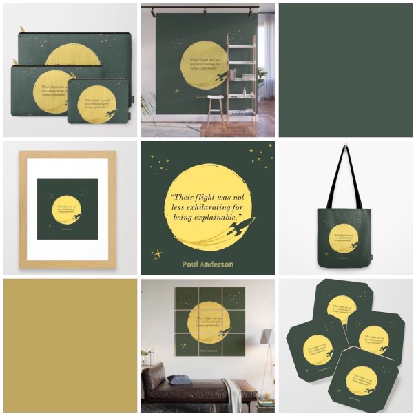
The Exhilaration of the Quotable (and the Explainable)
 But yesterday I was brought back to this quote by Poul Anderson, an author I had never heard of before a year ago, and this image I created to accompany it. The image turned out pretty well considering the limits of the app I was working with; as much as there is to love about Adobe Spark for what I do, the number of clip art options are overwhelming and difficult to search through. But for all the difficultly I ran into, it turned out exactly how I’d imagined it.
So of course I had to put it on a tote bag—because capitalism. Now through November 29th you can get 30% off + free shipping from Gas Station Burrito at Society6!

Puttering Around in Etgar’s Ice Cream Stand
“What are you doing over there,” my wife asked.
“Eh, nothing. Photoshopping a seal on a unicycle.”
She reacted as one would. It sounded ridiculous. It sounded ridiculous and stupid and that’s why I didn’t want to tell her what I was working on. Actually, that’s why I don’t like telling anyone what I’m working on. I’m accused of being secretive, of keeping too much inside. But I’m not being secretive, not really. I’m just embarrassed, because what I’m working on usually sounds stupid if I try to explain it.
It usually looks stupid too, when it comes to my graphic design/Photoshop puttering. Of course, I give up on a lot of these projects about a third of the way through them, so not only do they sound stupid if I try to explain it, but look that way as well. Every project is going to look like crap for the first third of its life. And the second. And most of the rest of the time, for that matter. Pretty much until that second you step back just to see how it looks and realize you’re done, whatever you’re working on is going to look like crap.
Well, you’re going to think so at least.
Somehow, and without really meaning to or intending to or believing I would, I finished this one. It wasn’t just a seal on a unicycle, I should explain that. That sounds stupid without the context, which would explain the confused look I got.
I’ve been fooling around with this story idea for a week or so, and to get a feel for it I wanted to do a little reading. Christopher Moore’s A Dirty Job was at the top of the list, and that was awesome. Next up was Etgar Keret’s The Bus Driver Who Wanted to Be God, a title that has been on my bookshelf for five or six years now. More specifically, it was the long short story “Kneller’s Happy Campers”. This story was the basis for the movie Wristcutters, starring Shannyn Sossaman, who a friend of mine will forever be in love with. His obsession with her and this movie is what put Keret’s book of short stories on my radar in the first place.
Keret’s story wasn’t what I expected and not what I needed for this writing project, but his book—his writing style—is exactly what I needed to get my head back in the game. From what I’ve read so far, his writing style is stripped down; simple but not basic, if that makes sense. There’s a feeling, a voice that runs through his stories, a narration. You’re looking into these stories, getting these quirky and dark and sad peeks into life. Even when the story is told in the first person, you feel as if the speaker is… disembodied, detached from their own life at the time they’re telling you this particular story.
Getting back to ‘Kneller’s Happy Campers’: at one point Mordy and his pals are on a little roadtrip through the afterlife for suicides, or those who ‘offed’. They stop off at an ice cream stand to celebrate the miracle of their headlights working, and chat up Sandra to find out what flavors might get them trashed.

Click on Etgar the Seal to check out this design on Society6
“Under her name tag was their logo—a seal in a clown’s hat riding a unicycle, and under that was the motto: ‘Low in price, high in flavor.’ ”
I had to putter. I had to. There was something about that quick description. I don’t know why I thought the seal also needed to be wearing a t-shirt and have an ice cream cone balanced on his nose, but he does need those things. Doesn’t he?
The stand had no name in Keret’s story, just a logo and motto, but it only made sense to call it Etgar’s. Right? And I know, my copy is only one of several different covers, but I used that as a template for my color choices and all that. You can do a lot with clipart and Photoshop. I think it was an evening well spent. Aside from some sizing and capitalizations—I know the font isn’t a perfect match, but I wasn’t getting sucked down that rabbit hole—I’d say I did a pretty good job.
